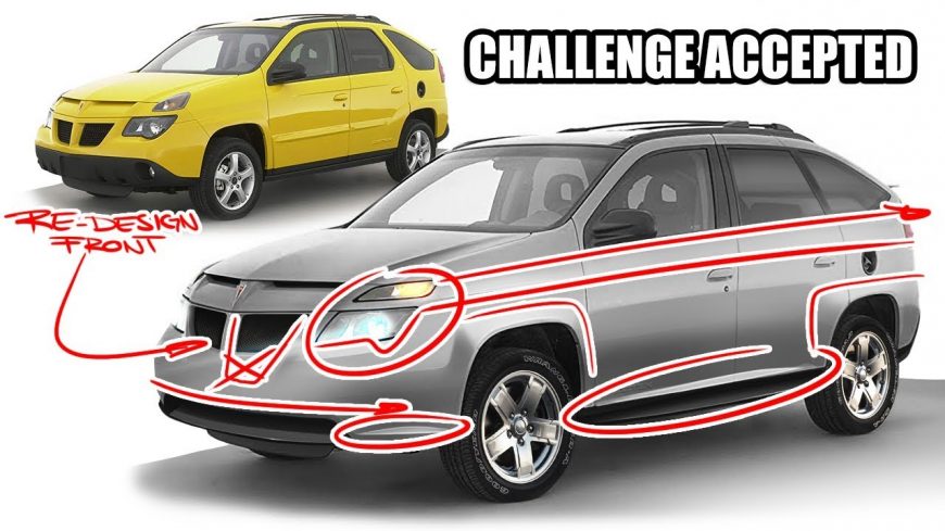
Graphic Designer Tries To Take The Ugly Out Of The Pontiac Aztek

Normally, we try not to be opinionated. We try to present the facts and let our readers make their own opinions. However, I don’t think it’s necessarily breaking any ground to say that the Pontiac Aztek is pretty ugly. We might even go so far as to say that people who buy it probably mostly agree. In fact, when looking at any kind of media that has to do with the ugliest vehicles of all time, yup, you guessed it. It seems like the only place where the Aztek has found its way to the heart of anyone is with people who find its ugliness kind of quirky. We hear that it’s also rather functional for those who don’t care about looks.
We aren’t quite sure how exactly something like this made it all the way to market. Someone really had to miss their mark here. However, that isn’t to say that all hope is lost for the ugly duckling in the Pontiac lineup. If this YouTube graphic designer that goes by TheSketchMonkey has anything to say about it, he’s going to bring this thing back to life. The goal is simple. He wants to take one of the vehicles that is widely regarded as the ugliest of all time and attempt to, well, un-ugly it, for a lack of better words. It will be an uphill battle, for sure. If we know one thing about Photoshop, though, it’s that it can make lots of ugly things pretty again. Just ask your girlfriend. Sorry, I couldn’t help myself.
By following along with the video below, we get a front row seat to this challenge. Naturally, by reconfiguring the entire vehicle, it would be incredibly easy to make anything look good. Therefore, within the confines of this challenge, we find the artist trying to keep a pretty similar look and structure to the original Aztek. In addition, he says that he tries to keep some features around that are distinct to general Pontiac design. After all, that is what makes a Pontiac, a Pontiac. Perhaps the brand attempted to force those design features into this model and it might have not panned out to their benefit.

