Kia’s Rebrand is so Confusing That it has 30k People Googling “KN Car Brand” Monthly

Kia has come a long way from what it once was. Formerly the “cheap” brand that provided people with budget-friendly stripped-down fuel sippers, Kia has become known for its high-brow designs today.
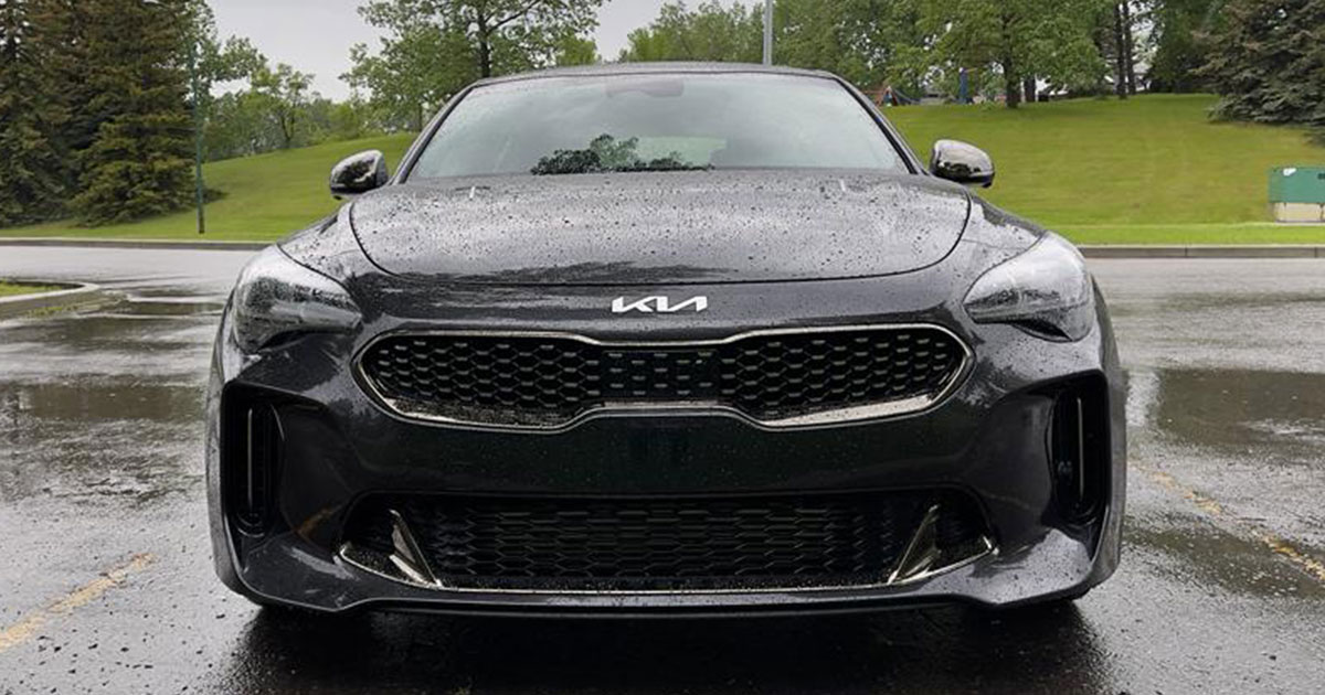
You can bet your bottom dollar that Kia is trying to take advantage of this newfound image and one way that they did that was by rebranding a little bit. Instead of the basic “Kia” write-out in a circle that we have all become used to and associate with being slapped on a tin can, the brand elected to go with something a little bit more sleek and futuristic to capitalize on its recent success in a new market segment.
However, apparently, somebody at Kia skipped marketing 101. Literally, the first part of building a brand logo is to convey your brand’s name in the simplest way possible. It should be so solid that even if somebody so much as glances at it, they’re able to take away the key information of what your brand name is. This is really the bare minimum.
While Kia’s new logo has the feel of a higher-class brand, it turns out that it’s pretty hard to read. With the redesign, the logo spells out “Kia” again but does so in such a way that makes it look like the letter “K” is fused to a backward “N.”
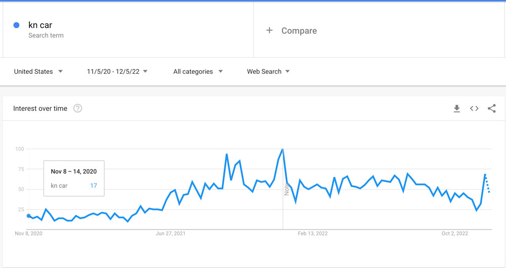
In fact, it is so hard to decipher for some that stories have been circulating the web pointing out that as many as 30,000 Google users search for the term “KN Car” every month. Our personal research turned up that other popular searches include “What is KN car brand,” “KN SUV,” and “KN Telluride car” among others.
the new kia logo is so unreadable that at least 30k people a month search for the “KN car” ever since its debut pic.twitter.com/jRj25JoAPp
— Ashwinn (@Shwinnabego) November 17, 2022
The search trend started to gain momentum right after the brand released the new branding back in 2021. Now, I’m not necessarily saying that the logo is the worst thing I’ve ever seen as it is relatively aesthetically pleasing. However, it’s kind of a head-scratcher as to how something like this made it past so many focus groups.

In fact, in a reaction video from automotive advertising company Sokal (seen below), a member of their team even points out this idea that seems relatively obvious.
At this point, we would be left to believe that the company will probably leave the logo as is and hope that eventually, it becomes recognizable enough that they don’t have to invest in another rebrand. For now, though, it seems as if this one might be heading for marketing textbooks as an example of what to avoid.

